Record Design – Patterns
|
The Record 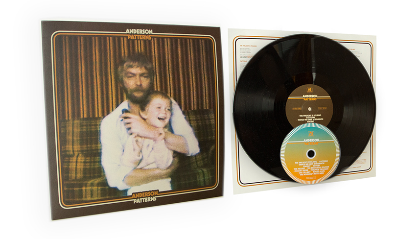 Below is an overview of the process, the approach I took and some background detail on its constituent parts. The Theme  Paul McCartney ‘McCartney’ (1970); John Lennon ‘Plastic Ono Band’ (1970); Simon and Garfunkel ‘Bridge Over Troubled Water’ (1970) Both released in the same year (1970), Lennon and McCartney’s debut solo records feature photos of children within the artwork. ‘Plastic Ono Band’ features a photo of a young John Lennon on the back while Linda McCartney’s famous photo of Paul nestling his daughter forms the back sleeve on ‘McCartney’. After years in a band perhaps a debut solo album provides a platform for personal reflection, something which seemed to be the case with this record also. The Simon and Garfunkel cover was a touchstone in a different way. Brothers in every sense other than blood perhaps, this image shows how certain photographic poses can reveal interesting details about the nature of a relationship between two people. It also illustrates how noise and grain can often enhance rather than degrade a photographic image. Family, the patterns of life and the nature of maturing relationships seemed to me to be amongst the main lyrical themes of the record. To represent these themes visually, in a central graphic image, was my aim. As it happened, the most appropriate source material imaginable had already been captured 30 years previously. The Image  Why Daniel Anderson’s father owned a VHS camcorder in the early 1980’s and how the tapes managed to survive long enough to land on my desk is a long story. But within those tapes was one sequence which I was drawn to straight away. Stabilised on a tripod, the camcorder captured several minutes footage of an empty couch against a wallpaper background; the contrasting designs making for a distinctive juxtaposition of visual patterns. As the footage rolls on, Daniel’s father walks into shot and after a minute or two of goofing around kneels down centre frame and casually grabs his son as he passes. In the brief exchange a second juxtaposition of patterns is rendered in frame. Drawn initially to the interior design, it was ultimately the patterns of genetic design captured in the foreground that made this image the ideal one to feature on the cover of a reflective record entitled ‘Patterns’, made by the boy 30 years later, when he was at the age his was father when the image was captured. The Border  Nick Drake ‘Bryter Layter‘ (1971); Bob Dylan/The Band ‘Before The Flood‘ (1974); Harry Nilsson & John Lennon ‘Pussy Cats‘ (1974) A familiar feature of many classic ‘singer/songwriter’ records from the early 70’s period was a solid one or two colour square border around the edge of the sleeve. The border used on this design probably reflects an amalgamation of the three borders from these record sleeves above: the shape of ‘Before The Flood‘, the form of ‘Bryter Layter‘, the style of ‘Pussy Cats‘… The Typeface  Rodriguez ‘Cold Fact‘ (1970); Bob Dylan/The Band ‘Before The Flood‘ (1974); Paul Simon ‘Paul Simon‘ (1972). Type is a crucial aspect of establishing a musical act’s visual identity. Many fonts/typefaces have become synonymous with particular periods or are renowned for representing certain stylistic values. The Kabel font was one that seemed to work immediately when applied to this project. It feels classic without being overly retro or pastiche. Also a factor is the size and placement of type on the record which echoes the minimal deployment of type on the Dylan and Paul Simon sleeves above. The Colour  Various Artists ‘Four Songs by Arthur Russell’ (2007); Lee Hazlewood ‘A House Safe For Tigers’ (1976); Super Furry Animals ‘Phantom Power’ (2003). There’s White albums, Black albums even Grey albums but this always instinctively felt like a brown album to me. There simply aren’t enough brown albums in the world. Some of my favourite record sleeves exude “browness”, such as the three above. It so happens that the music contained within all three radiates a sense of organic, autumnal warmth. Accident or design? The Collaborator
I came to a point in the design process where I was keen to get a fresh perspective and lean on the expertise of another designer whose work and opinion I appreciate. Niall McCormack is a Dublin based graphic designer and a leading authority in the history of Irish book design. I’ve long admired his own record sleeve and book cover designs from afar so naturally I was delighted that Niall enthusiastically agreed to collaborate on the project. His design, layout and printing expertise was invaluable to the process and the resulting design is testament to his sound guidance and direction. The Mock-Ups  Several mock-ups were designed as myself and Niall exchanged ideas and experimented with variations on the image, framing, layout and colour palette. The Final Design The cover finalised, the insert and labels and CD were completed as extensions of the cover design. The Release
In the weeks following the album’s release it was nice to see the record turn up on TV, in the press, on social media feeds and most importantly on listeners record decks. |


